Our first experience on the red camera was Sole Mates. Everyone had a specific role in their department, and mine was a camera operator. I was very excited that we were given the opportunity to be filming on 2k, a few steps up from DSR 570. It brings major difference in the quality of the product.
In the morning of day one, the wonderful red blessed us with great footage, but in the afternoon it decided to break down. Very quickly our team readjusted and came up with a solution of using another camera. Although not perfect, Canon 550D carried out the rest of the shoot. I'm pleasantly surprised that we pulled off an entire short on a stills camera! At first, the director and DP must have gone through all stages of panic, but managed to keep our spirits up and most importantly showed their trust in us as a camera department. However, the 550D doesn't give as many options on the overall look of the film as the red, so the decisions on some shots had to be amended. Quite often we had to improvise attaching the camera to a tripod it was not meant to mount on (with a pizza box!), or even attaching it to a bicycle (which actually worked out quite well)!
The lenses available to us were EOS 50mm, EOS 18-55mm, EOS 28-135mm, EOS 55-200mm. In other words, we had only one prime lens instead of 6 RED Primes. I discovered that the long lenses have great limitation in lighting, with an aperture of maximum 5.6, so we had to use twice as much lighting indoors for night shots than we would have with the red lenses. Furthermore, since we hired some filters for the red, we decided to make use of them as well. With an Italian clamp and a few other clamps, a mat box was attached to the Vinten head and luckily the camera fitted onto it. The NDs were of great help for an exterior scene in John Street when the sun is high up and throws harsh shadows. There were some complications because of our imperfect attachment of all the components around the camera, the result of which were unpleasant reflections between the glasses, that eventually got fixed. I'm glad we used filters because it gave me further insight why we need them, especially outdoors.
To continue with, another difficulty that we faced as a camera department was the change of roles among the assistants. When working on the red camera, we all know what to do. But on a small camera like the 550D, it is pretty difficult to use a first AC, even though help is needed. For example, with focus pulling, the distance between the focus points on the lens is so tiny that it was easier for me as an operator to pull focus than ask the first AC to do it. On the other hand, when I had to pan/tilt and follow the character it was very hard for me to keep the focus, so then I definitely needed assistance. Moreover, even measuring and remembering the focus points was mainly done with my fingers, since the marks on the lenses were not clear at all. The small camera screen and lack of any other connection to a bigger monitor limited the picture of the shot to only the DP, camera operator and the director. Any DP would experience hard times when they can't always see how the shot looks like. It reminded me of the early days of film cameras and how probably the directors had a look through the viewfinder only occasionally, because they relied on the DP. In our case, we took a risk with using a small stills camera instead of switching back to the tested Sony 570. We succeeded, because we transferred our knowledge first from the Sony camera to the Red camera, and then from the Red to another model.
Now when I look at Soul Mates in retrospective, I'm convinced how well our class works together. The main thing we have in common as a crew, is that we prioritise the storytelling and try our best to overcome any technical issues in the name of the final product. I saw growing in each one of us since Melissa's Mail, Love Mugs& Stickmen and Little Clown. We spent a lot more time on the actors and their performance and it definitely gave results in our end of year project together.
Thursday, 17 June 2010
Saturday, 5 June 2010
Paperskin

Assisting on the grads was a good experience, on one side working with a different crew, on the other- learning to be more professional. My role was a second AC, which I had to share but at least I did the fun bit (the clapper board!). On the first day there were lots of awkward moments like "tilt for the clap", "on the end", "strike the board", which I would always mess up because I've never been familiar with these terms. But now I have an idea how it works. I bet the editor is having fun listening to my "ssssecond clap" at this moment. On that day I remember the red camera seemed very complicated and now after a week working on it I'm much more comfortable. One of the greatest advantages we have with such a camera is the wide choice of lenses we can use to imply meaning to the scene or the character.
Back on the grad shoot, I was observing what each person was doing and noticed how relaxed the atmosphere was. I am always stressed on shoots no matter what my role is, but everyone there was so chilled even I relaxed. The first AD was doing great job not stressing anyone, but gently pushing the work forward. It is the great preparation of the camera department, director and his actors that made that possible. Otherwise even the greatest AD wouldn't be able to organize the crew if they haven't done the work in advance.
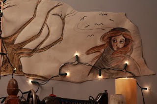
I must mention the Art Department did an excellent job as well, creating a mood with images we all enjoyed to work around. Charlotte did drawings for the wall while Ashley arranged them in a collage. I was trying to explain to myself why certain lights are being used, the number of them and what's their purpose. Lighting for film has always seemed difficult, but now I think I can work out the wattage needed for daylight and tungsten, and try to think of the position of the lights regarding the object. I started using my eyes more and play with the aperture to achieve the right exposure. On my camera, I play a lot with the shutter speed as well, but since the red uses only 1/50 I can't really touch that. I read somewhere that the lower the shutter speed, the smoother the movements will appear. I wonder if it's possible to use 1/30 or 1/20 in the epic or scarlet.
What Daniel was visioned to be:
To sum up, it was a pleasure to work on a different set and learn so much about communication and collaboration, rather than technical knowledge which is also gained but is not the most important to me. I hope for the first film we're making next week we manage to create the same relaxed atmosphere.

Tuesday, 25 May 2010
Momcheto si Otiva

Since I've blogged about various international and American films, maybe I should write about a Bulgarian film as well. A classic from the 70's, translated as "The Boy turns Man", directed by Людмил Кирков , the film tells the story of Ran who is about to graduate from high school and continue his journey into the endless, but in the same time constricted sea of the socialist life. Bright and ambitious, Ran doesn't intend to follow any safe path that is laid for him. The small town community he's grown up in inspires him to write about the old habits and old fashioned way of thinking and how they clash with the new tendencies among the teenagers. Instead of sticking to the norms, he questions them and eventually breaks from them to discover his personality and interests.
Ran is into literature and dreams to become a journalist, an education that has been removed from the major universities as an attempt to crash young people's desire to express their view and provoke others to aspire for a change. The film deals with the time it's set in masterfully, delicately showing the reality of unparalleled morals combined with the subtle control of the government. Just when Ran is about to graduate, journalism is renewed in most universities, but his parents and the society in general don't perceive it as a "real" profession. A real profession instead, is something steady you start up when you're 20 and stay on it for the next 40 years.

The new generation, however, slowly produces people like him, who are not entirely sure wether this is the right formula for happiness. Throughout the film it is implied that the boy is a lot more mature than his peers. He is infatuated with a middle aged lady who works in a bakery shop and he comes there every day for a lemonade. His best friend seems to be a local middle aged bohemian painter he shares everything with. When a famous singer visits the city, he tried to impress her and brings her out on a date, but is somehow disappointed and returns to first infatuation. I think the beauty of the film comes from the subtext and the tangible romance between the two characters, intertwined with Ran's search for himself and his values. He stands up for the whole school and fights with the rules that all the boys who graduate need to undergo a very short haircut. Like many other pointless rules like this one, he is fed up with his previous life and looks forward to the period when he'll be a "free man". No matter what new he undertakes though, he always returns to the bakery shop and timidly orders a lemonade, silently building expectations and dreams in the bakery lady who is a prison of her marriage and mundane life. These two characters have created a relationship without even having to introduce each other, so when he appears in the bakery shop, we know it's their happiest moment of the day.

While every other teenager is preoccupied with prom preparation, Ran doesn't notice that a classmate who is also a friend of his is infatuated with him. On the night of the prom all the students look forward to leaving for the capital, where it's implied the new academic life waits for them. Ran has to leave as well, with his classmate and he tells her they will meet there. Very subtly the film deals with the change of the student as an individual who continues on his way to become his ideals, and the bakery shop lady who has missed so many chances and possibilities and is entrapped in her own security. Their most intimate moment is summed up in a hug, which we know has been cherished from both but can never last in these circumstances.
What I enjoyed about this film is the tone it sets as well as characters built with many nuances and feeling more real and exciting even in their passively introspective moments. Maybe another reason is that the theme of uncertainty around the desire of "stable life" is still valid and is getting a lot more popular than it used to be. Unfortunately, the film is not accessible in English language.
Sunday, 25 April 2010
Belgium Cinemas
 My short trip to Belgium became quite film related, after I saw so many beautiful old cinemas on random corners of the city center of Brussels. Unfortunately I missed my chance to go to a special one for old silent European films. On some days, American silent films are played there as well. What I liked most about these small cinemas is the loyal viewers who come back again and again, despite the many empty seats around them. In a way the country itself promotes local films and European films far more than any
 others. I saw very few commercial cinemas (with a lovely design though!) , but they were all promoting a Romanian film I forgot the name of. The poster made it look like the most important film of the year and the actual blockbusters had smaller size posters. It's interesting how the cinema owners direct the attention and control the audience preferences.Here is a picture of one of the commercial cinemas, which I still find quite sophisticated from the outside.

I met someone who works in a small cinema and they told me most of the times people go there by themselves, as if to clear their heads or to find peace and intelle
ctual food in the philosophical stories the films offer. I used to love going to the cinema alone and now I have no time even to feel nostalgic. Besides, it reminds me of Travis Bickle from Taxi Driver and his lonely habits. (There are porn theaters in the area as well! I shamelessly took a photo)
Brussels has some lovely streets and old squares that attract film crews. I was playing a cache game (which I renamed Da Vinci Code) with a GPS, that apparently is the latest fashion for frequent travelers. You go on a special website and find the coordinates of the starting point and then you wind up at places in the city that the locals love, but are not so popular among the tourists. So our first task was to count the attic windows of this building:

YES! You are asking yourself the same question, which ones from the 1000 are exactly supposed to be considered as attic windows? Besides, first we had to consider the plenty of other old building to decide which one is the right one. While straining our brains with the Da Vinci Code game, a French film crew started setting up a track in front of us!
How lucky is that?


It turned out they were filming a scene from a film called "Avec tout ma force" with Vincent Lindon. A very simple scene, where he's pretty much showing around a young boy the old square. It is directed by a lady who I took for production assistant. It was because the actor was so involved in watching the monitor I assumed he directed himself! But that film crew was very organized and the poor AD stood out from miles, hustling the extras.
Unfortunately I don't remember watching any films with this actor but Benoit told me he and the director are quite famous.
Apart from the cinemas, I couldn't miss the local specialty! From all the beautiful old squares and film crews, one suddenly gets tired and that's when it's a time for a waffle at 1 am! (when every other tourist remembers to have one)


P.S - A random prop I found on the street. I would have actually taken it if It was smaller!

Thursday, 18 February 2010
Sunset Boulevard and Art Direction

Sunset Boulevard is a 1950s film noir, written by Billy Wilder and Charles Bracket and directed by Billy Wilder. In this blog, I will look closely at frames from the scene where the two main characters meet and analyse the Mise-en-scène in terms of art direction. Joe Gillis (played by William Holden) has a flat tire and stumbles into Norma Desmond’s great mansion, but is mistaken for an undertaker. Ascending the stairs to the silent picture star’s room, he is entering deeper in her eccentric world and is gradually about to be engulfed by it.
The first time we see Norma Desmond (played by Gloria Swanson), she is standing at the doorway. Billy Wilder has built a well-defined image of her personality in his screenplay that would give ideas to the Art Director Hans Dreier: "She is a little woman. There is a curious style, a great sense of high voltage about her".(1)

Indeed Norma looks tiny framed between the two candlesticks. The high ceiling and the doorway aid the desired effect, but despite her small size, the gothic interior and her appearance suggest a dominant personality. Billy Wilder and Charles Bracket have pictured Miss Havisham in Dicken’s Great Expectations while constructing Norma Desmond’s character of remarkable oddity. Similar notion of expectation has already been formed in Joe Gillis at first glance of her gothic mansion. Furthermore, the old-time star hides beneath her dark sunglasses and prefers artificial light, even though it is a bright and sunny day outside. Typical for film noir, this scene plays with rich layers of black and gray nuances, which combined with Norma’s black house pyjamas and pale skin creates almost a vampire sense about her (6). In this frame, the cinematography is the key element as well as the production design to establish the character. Norma is surrounded by deep shadows, an inkling of the hidden dangers in this woman. The actress Gloria Swanson completes the character with her posture and demanding gestures.

After establishing the first impression of Norma Desmond, the narrative leads us into her bedroom, along with Joe Gillis,to get an even further understanding of that peculiar woman. The Hollywood ex-silent movie star is lost in her imagination. Hans Dreier has tried to convey that sense through exaggeration, adding more into the frame. He brings the ornate interior with excess of detail he has seen in the silent movie stars’ homes to establish Norma’s lavish taste, as well as emphasize the decaying old glamour. (2) The bed in the shape of swan for example, is an extravagant detail typical for a self-indulgent movie goddess. In this scene it becomes clear that Norma is struggling to cope with her past glory. Evidence of that is her room itself, infused with relics of the silent era. The actress has encircled her bed with porcelain dolls to remind her of the many loyal fans, who would never betray her. Moreover, they make her feel important and significant. Norma successfully nourishes her illusions and manages to win our sympathies. The star’s photographs dominate the frame and infuse her world filled with memories of her heydays. In the bedroom again she prefers artificial light and has concealed the windows with layers of curtains. The production designer has chosen both vertical and horizontal direction for the curtains to reinforce the sense of isolation and reclusiveness from the outside world. Hans Drier describes his aim to shape the production style of Sunset Boulevard as “a world as strange and absolete as that of ancient Peru” (2). Up to this point, we’ve been already introduced with plenty of features implying the oddity and lavish taste of Norma Desmond. But the most extravagant one is yet to come. In the middle of the frame we notice that the characters are heading towards something like a small altar. In fact, it is the star’s massage table where her dead chimpanzee is laid.

Norma’s pet is lying on a satin and lace pillow under a Spanish shawl. This frame very subtly implies the future development of Norma and Joe’s chance acquaintance. Little does he know that he is about to replace the dead chimp and voluntarily give up his writing ambitions to become a kept man. Wealth enables Norma to spread her power over Joe.
Another key feature in building Norma Desmond’s character is her costume and make-up.

Paramount’s famous costume designer Edith Head describes her task in Sunset Boulevard as the most challenging in her career. She follows Hans Dreier’s approach to exaggerate more. The basic lines of Norma’s black house pyjamas are from Dior’s New Look introduced in 1947. The idea is to have a very tight waste and a very full skirt, but Swanson’s waste is not as trim as once. (3)


Since it is a relatively new style for a character who lives in a 1920’s mansion, embellishments are added to personalize her costume and reflect Norma’s taste. In this case, it is the leopard-patterned turban, dark sunglasses and many silver bracelets to underline the star’s eccentric look. Edith Head comments on the clothes as only “a triffle outdated, a triffle exotic” (4), to keep Norma fashionable in the same time as out of fashion. She expounds on her approach further: "Because Norma Desmond was an actress who had become lost in her own imagination, I tried to make her look like she was always impersonating someone." (4) Head has also relied on Swanson’s expertise because “she was creating a past that she knew and I didn’t” (3). Moreover, the costume designer has had great confidence in the cinematography to convey the character of Norma’s clothes. Both the lighting and the make-up contribute to the star’s youthful appearance. The make-up supervisor Wally Westmore works on William Holden’s mature looks and softens them to make him look younger, instead of imposing Norma’s age (5). The effect is a more sophisticated and glamorous figure than the one Billy Wilder has originally anticipated.


In conclusion, we make assumption about film characters based on their environment. The art direction in the selected frames from Sunset Boulevard successfully builds Norma Desmond’s eccentric character and implies her destructive power. As an observation on Hollywood and its products, the creative panel has managed to create one of the most memorable screen characters.
Billy Wilder & Charles Bracket Sunset Boulevard screenplay, 2nd ed. University of California Press (1)
Baker, Patricia .1991. Fashion of the a decade: the 1940’s. London: B.T Batsford
Baker, Patricia .1991. Fashion of the a decade: the 1950’s. London: B.T Batsford
Brode, Douglas. 1980. The films of the fifties. 2nd ed. Citadel Press
Cooke, Grayson.2009. We had faces then: Sunset Boulevard and the sense of the Spectral. Quarterly Review on Film and Video. 26:2 89-101 (6)
Taylor, Aaron. (Summer 2007) Twilight of the Idols: Performance, Melodramatic Villainy, and Sunset Boulevard . Journal of Film & Video
Trowbridge, Katelin. The war between words and images- Sunset Boulevard New York University Journal
Staggs, Sam: Close-up on Sunset Boulevard: Billy Wilder, Norma Desmond and the Dark Hollywood Dream. St. Martin's Griffin Books, 2002. (4)
Ed Sidkov, Commentary, Sunset Boulevard DVD Extra Features, Paramount (2)
Edith Head, The Paramount years featurette, Sunset Boulevard DVD Extra Features, Paramount (3)

Photograph 1

Photograph 2

Photograph 3
Another key feature in building Norma Desmond’s character is her costume and make-up.

Photograph 4


Photograph 5 and 6
Since it is a relatively new style for a character who lives in a 1920’s mansion, embellishments are added to personalize her costume and reflect Norma’s taste. In this case, it is the leopard-patterned turban, dark sunglasses and many silver bracelets to underline the star’s eccentric look. Edith Head comments on the clothes as only “a triffle outdated, a triffle exotic” (4), to keep Norma fashionable in the same time as out of fashion. She expounds on her approach further: "Because Norma Desmond was an actress who had become lost in her own imagination, I tried to make her look like she was always impersonating someone." (4) Head has also relied on Swanson’s expertise because “she was creating a past that she knew and I didn’t” (3). Moreover, the costume designer has had great confidence in the cinematography to convey the character of Norma’s clothes. Both the lighting and the make-up contribute to the star’s youthful appearance. The make-up supervisor Wally Westmore works on William Holden’s mature looks and softens them to make him look younger, instead of imposing Norma’s age (5). The effect is a more sophisticated and glamorous figure than the one Billy Wilder has originally anticipated.


Photograph 7 and 8
In conclusion, we make assumption about film characters based on their environment. The art direction in the selected frames from Sunset Boulevard successfully builds Norma Desmond’s eccentric character and implies her destructive power. As an observation on Hollywood and its products, the creative panel has managed to create one of the most memorable screen characters.
"I AM big. It's the pictures that got small!"
-Norma Desmond
Bibliography:
Billy Wilder & Charles Bracket Sunset Boulevard screenplay, 2nd ed. University of California Press (1)
Baker, Patricia .1991. Fashion of the a decade: the 1940’s. London: B.T Batsford
Baker, Patricia .1991. Fashion of the a decade: the 1950’s. London: B.T Batsford
Brode, Douglas. 1980. The films of the fifties. 2nd ed. Citadel Press
Cooke, Grayson.2009. We had faces then: Sunset Boulevard and the sense of the Spectral. Quarterly Review on Film and Video. 26:2 89-101 (6)
Porfirio, Robert (July 1975). Billy Wilder about film noir- an interview
http://www.imagesjournal.com/issue10/features/wilder/
Accessed on 10.02.2010 (5)
Taylor, Aaron. (Summer 2007) Twilight of the Idols: Performance, Melodramatic Villainy, and Sunset Boulevard . Journal of Film & Video
Trowbridge, Katelin. The war between words and images- Sunset Boulevard New York University Journal
Staggs, Sam: Close-up on Sunset Boulevard: Billy Wilder, Norma Desmond and the Dark Hollywood Dream. St. Martin's Griffin Books, 2002. (4)
Ed Sidkov, Commentary, Sunset Boulevard DVD Extra Features, Paramount (2)
Edith Head, The Paramount years featurette, Sunset Boulevard DVD Extra Features, Paramount (3)
Photographs
1,2,3,4,7, 8
Sunset Boulevard (1950)
Directed by Billy Wilder
Paramount Picture
108 min
Photographs
5 and 6
http://jerkmag.files.wordpress.com/2008/10/the-new-look-sketch.jpg
Sunset Photo
http://www.deccarecords-us.com/images/local/300/1135E.jpg
Thursday, 11 February 2010
The Princess and the frog

If feels like we've been waiting for ages for Disney to excite us with a
new 2D animation, and here we are
today reviewing The Princess and the frog! While watching this film, I
gradually realized
how much the audience expectations have changed since The lion king and the other princess stories.


As the title suggests, the story is about a princess who kisses a frog, and then... simply transforms into a frog as well. Set in the city of jazz, Tiana's fairy tale is brought into life with bright colors and funky beats. New Orleans transmits the vibe of an entirely separate main character through its customs and rich culture. A few years ago I was wondering
where would Disney plan their new animation, since they've done most popular cultures. I thought the most obvious choice would be Africa or India, but New Orleans is pretty good as well. At least it gives the characters a reason to burst into singing and dancing,which to me is an inseparable and most magical part of Disney.

In contrast with the rest of Disney's animations, the prince here is quite active, in control and is given a significant amount of attention. There is a gradual development from Snow white, where the prince had barely a few lines, through Sleeping Beauty, with the hero being introduces in the middle of the story. I approve of this new initiation, breaking out of the cycle of predictable, ordinary and undistinguished "princes". Usually they are simply there to safe the princess, who embodies the image of perfection. But in the new animation, both characters have flaws and are expected to fight and overcome them. It seems than prince Naveen had stronger shortcomings than the princess, but that didn't lead me astray from the story.
Another strong impression I got from this film is how fast things are happening. Normally the characters will go though plenty of obstacles but also share the intimate moments of success. From these points we realize something is beginning between them. But that is not necessary for the contemporary young audience. Such taste require more action based situations and far more flirty characters than ten years ago. With the exception of the songs which I immensely enjoyed, the magic seemed hazy and the overall lifting experience was not one hundred percent full.

However, the film introduced the biggest twist in motion& animation picture industry: When the firefly Ray is squashed, he finally unites with his beloved star Evangeline, by actually becoming a star! And not only any star, but the second brightest star! I just sat there admiring this outcome. I am sure that Disney have had some pretty serious discussions whether they could murder the character on screen. Because no one good ever remains dead in fairy tales, they were obliged to deliver a satisfactory reason not to bring the firefly back to life. I think they did that in a brilliant way. By all means, I enjoyed the classic style of Disney's animation which has been missed by more than one fan.

Sunday, 24 January 2010
Wild Strawberries
"I hope I never get old so I get religious"

the family.
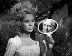
Dr Isak Borg visits a number of places that hold precious memories of his c
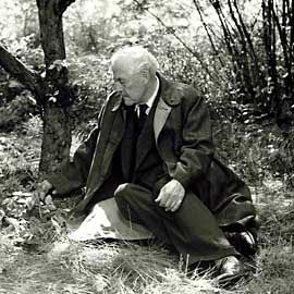
hildhood and adolescence. He has always been busy doing something else,instead of enjoying the company of the ones he loved. One of the places is a strawberry lawn, where he fe lt in love and lost his lover because of his brother. He meets three youngsters going away traveling and a married couple with problems. They all end up in his big car and through them, he relives some of the sorrow he'd had,as well as the best years of his youth.
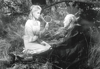
I love the part in the beginning, when Isak has a nightmare of being death. It features stunning elements from the German expressionism and it makes you read the frame, be active in the process of watching. In a way, this film makes me very calm through the use of white colors, but also provokes interest to find out what is going on deep under surface.
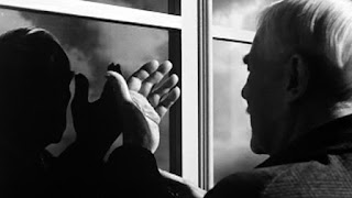
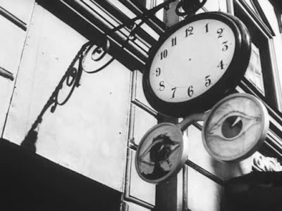
When Bergam has made this film, he though it was about a doctor with certain flaws and that was all. Later on he admitted to himself, it is actually exploring his own family. It is interesting how much our lives influence the films we make, without realizing. In screenwriting, they make us admit out darkest secrets, so we are aware of what really bothers us.
Bergman believed that Dr Isak was his father. Only after a few years he was able to admit it was himself he was trying to portray, through the experience in his family. He has felt as an unwanted child, and has grown up in the same atmosphere that has produced Isak. The final scene in the end sums up beautifully Bergman's dearest memories and longings of his family at the sea coast, enjoying the afternoon fishing.
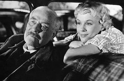
In a way, Bergman reminds me of Wong Kar-wai because of the similar philosophical topics they explore. Both of them intrigue the audience with the deep psychology going through the
characters.

Subscribe to:
Comments (Atom)


